Problem Space
About a week before my professor assigned this project, I was trying to buy tickets for my first football game at U of M ever. I was cycling between Facebook, Reddit, and GroupMe trying to find which tickets were selling at the best price, and messaging sellers on each app. The seller would reply, "sorry, it's been sold." or sometimes not reply at all.
When I was finally able to land on a ticket, I had to communicate with the seller through FB Messenger, send the money through Venmo, and receive the ticket through U of M's online ticketing site. I couldn't help but think that there should be an easier, more secure method to do all of this.
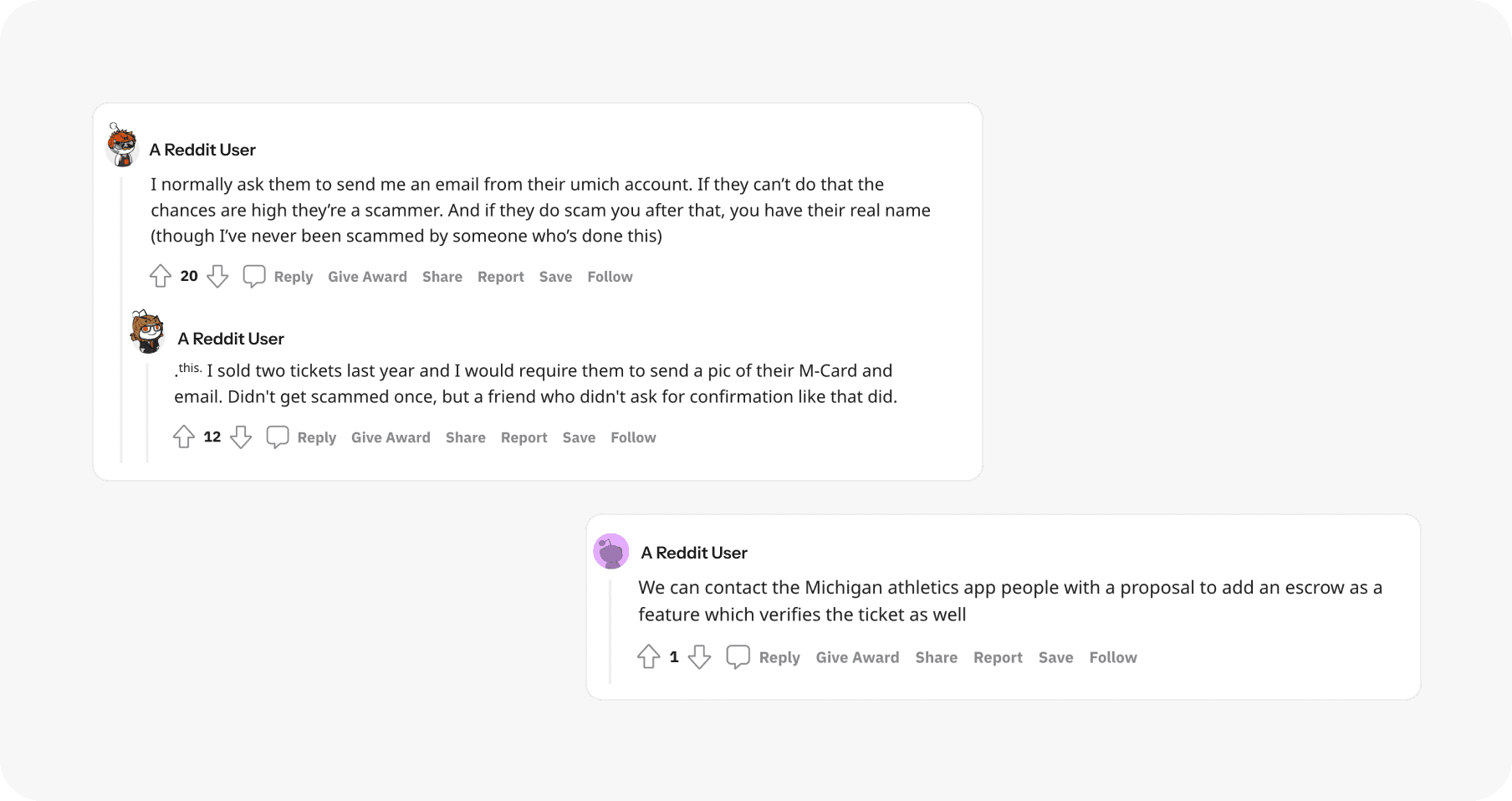
Others think similarly. From r/uofm:

THE CHALLENGE
U of M students are looking for an easy and reliable way to buy and sell U of M football tickets as well as transfer money and tickets on the same interface. The current methods use multiple apps and are susceptible to scams, and students need a more convenient method.
USER FLOW
Comparing and contrasting the seller & buyer
Through this, I can understand more about the needs of each role and where they share similarities. I aimed to simplify the decision-making process for a smoother experience.

Iterations
I originally designed this app in a class at my university called Digital Product Design. "Football games" was one of the prompts we were given for our first design project.
While looking back on this design, I felt unsatisfied with parts of the interface and felt that I could streamline the visual design and usability. After receiving feedback on the project, I started working on the second iteration of this app.
EARLY DESIGNS

BEFORE & AFTER


Sign up
ISSUES
❌ Under-developed UI
❌ Not enough information collected
IMPROVEMENTS
✅ Card layout with icons and suggested text
✅ Stronger visual hierarchy and accent colors
✅ Clear direction for user input


Browse Tickets
ISSUES
❌ Minimal visual cues
❌ Buttons create clutter on overview
IMPROVEMENTS
✅ Removed redundant information
✅ Added profile pictures, usernames, and filtering system


User Profile
ISSUES
❌ Unclear visual hierarchy
❌ Unable to access both listings and transactions
IMPROVEMENTS
✅ Added toggle for increased functionality
✅ Integrated accent colors strategically
Final Designs
visit interactive prototype
M-TIX allows students to be both the buyer and the seller whenever they want. Buyers can browse tickets, message sellers, and send payments, while sellers can list tickets and transfer them.
🎟️ For the Buyers:


Browse listings
Students can pick from a list of all home games that are included in the U-M student season passes, and browse ticket listings for each game.

Messaging
Students can click the "Message seller" button on each ticket listing to start a conversation. Students are able to converse and negotiate ticket prices.


Transferring Payment
Once a bank account is linked, students can transfer money for a specific ticket by visiting the recipient's profile. The transaction is not complete until both sides accept, and there is the option to withdraw.
💵 For the Sellers:
Listing a Ticket
Ticket listing is easy to access on the home page, where users can click "New Ticket Listing" and input the game, seat, price, and notes for the ticket.


Sending a Ticket
Students can send a ticket by visiting the profile of who they want to send the ticket to and selecting one of their listings from the drop-down menu. The ticket will appear in the message chat.


🤝 Finalizing the Transaction


Accepting Tickets & Payment
Students receive the transaction in their messages and choose to accept or ignore. The transaction will go through once both parties accept, and they will receive it in their profile page.
Students can transfer money to their bank and tickets to Apple Wallet.
Reflections
Working on this project was a great learning experience, and I'm very glad I took the time to redesign it! I learned a lot from the initial class project and the feedback I received from my peers and professors throughout. I have definitely improved the efficiency of my designs, developed a stronger sense of visual identity, and have a better idea on how to tackle design problems through a user-centered lens.


