

THE CHALLENGE
Growing Hope currently lacks a centralized and accessible way to share information about their mission, programs, and amenities. As a result, visitors and volunteers struggle to gain a comprehensive understanding of the farm’s resources, events, and opportunities, limiting their engagement and participation.
PROJECT OBJECTIVES
🥕 Create a framework & prototype for a centralized information system so that operational knowledge can be shared amongst internal and external stakeholders.
🌱 Improve visitor and volunteer experience by engaging the community through real-time updates and easily accessible information about Growing Hope's mission.
Research Questions
These questions helped identify the existing knowledge gaps within the staff, visitors, and volunteers, driving the goals for our design solution.
METHODS
12
User Interviews
Explored the volunteer experience and evaluated whether or not there were sufficient resources and information available at the farm.
2
Field Studies
Observed how visitors navigate the physical space at the farm, how they utilize existing resources, and any confusion they may have experienced.
17
Survey Responses
Provided us with benchmark data on users' perception of Growing Hope’s mission and values and identified areas where information may be lacking.

FINDINGS
The farm's physical space effectively communicates Growing Hope's mission to new visitors, though there's a desire for clearer wayfinding and signage to enhance the experience.
65%
81%
90%
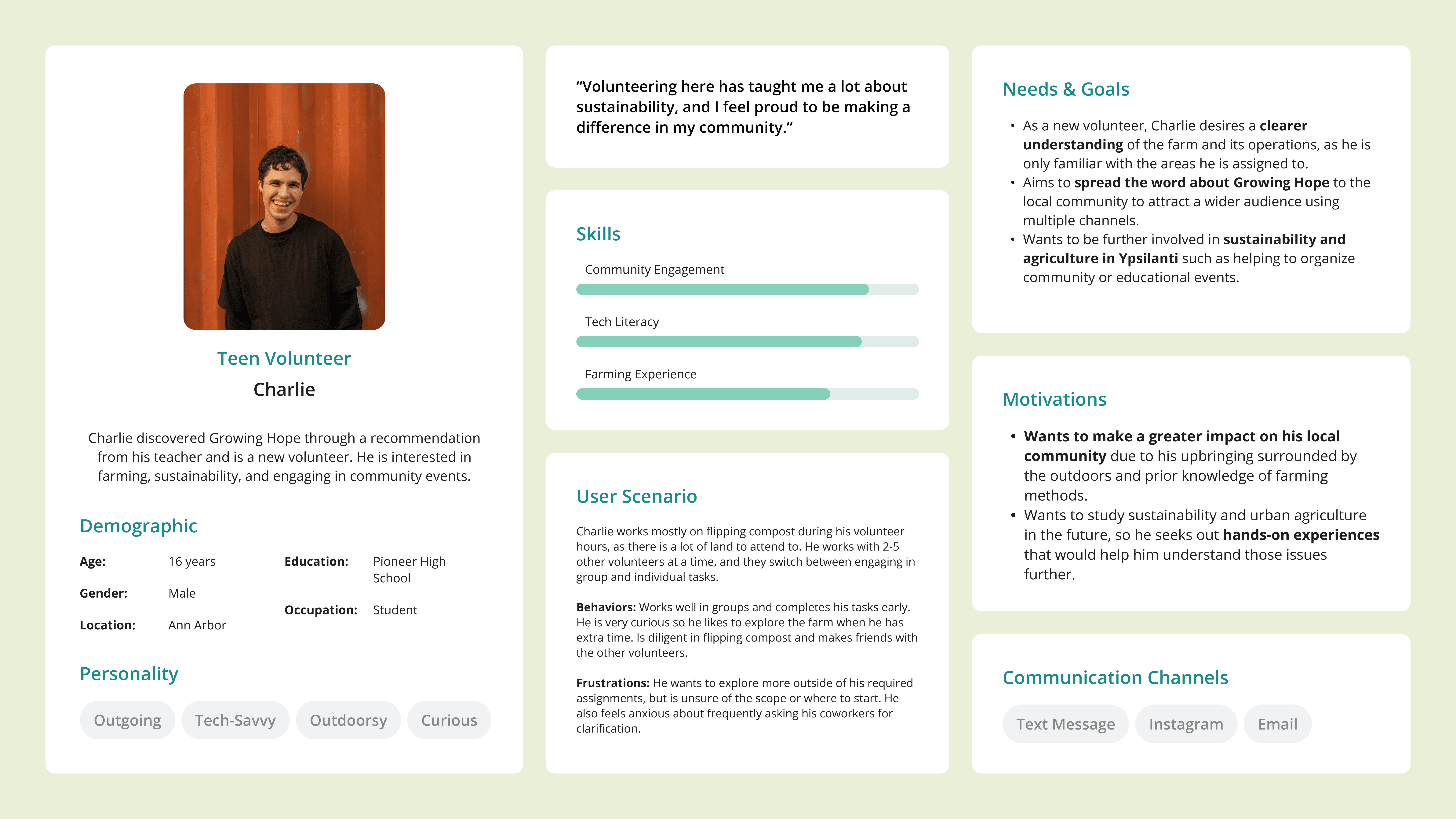
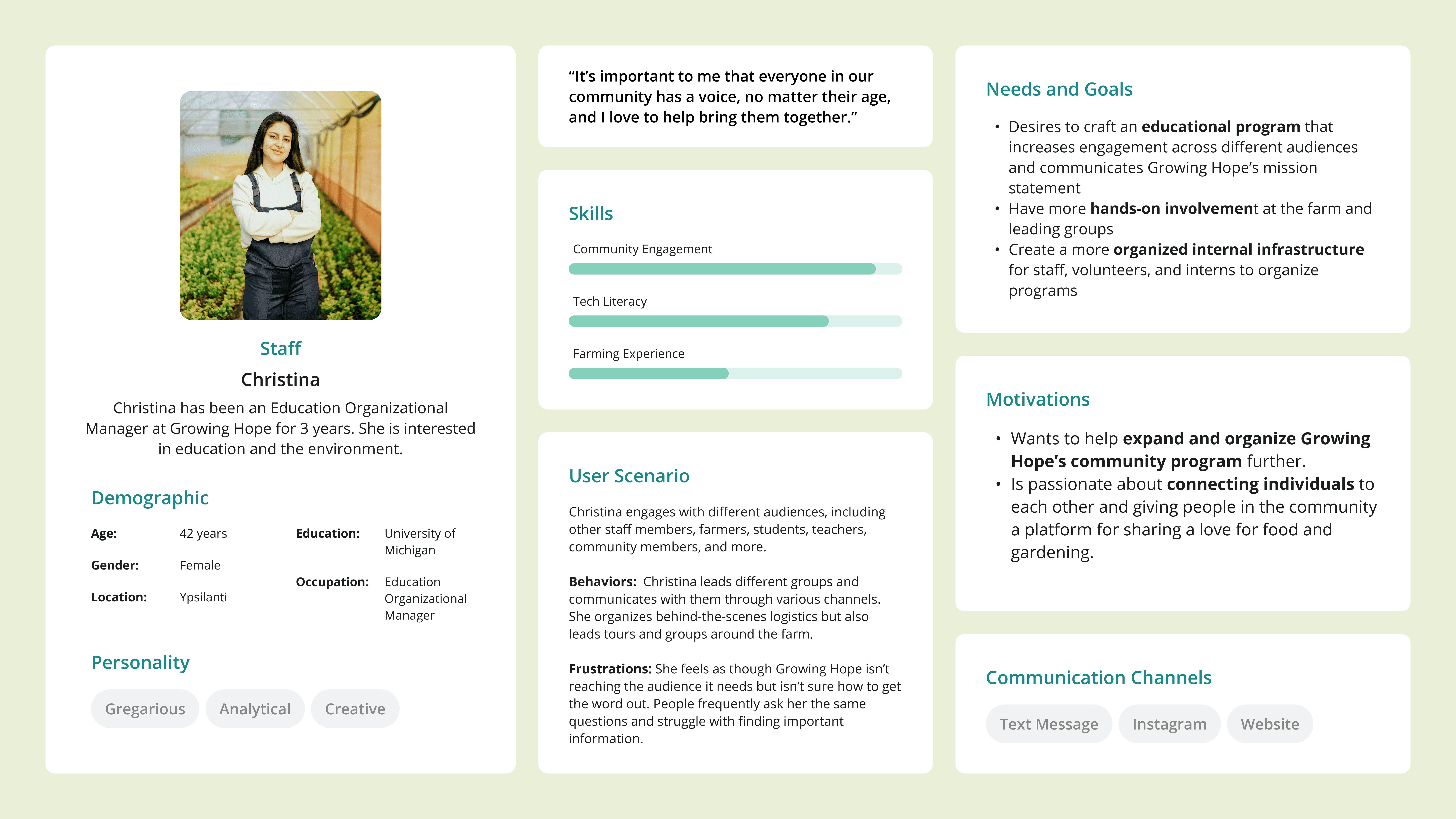
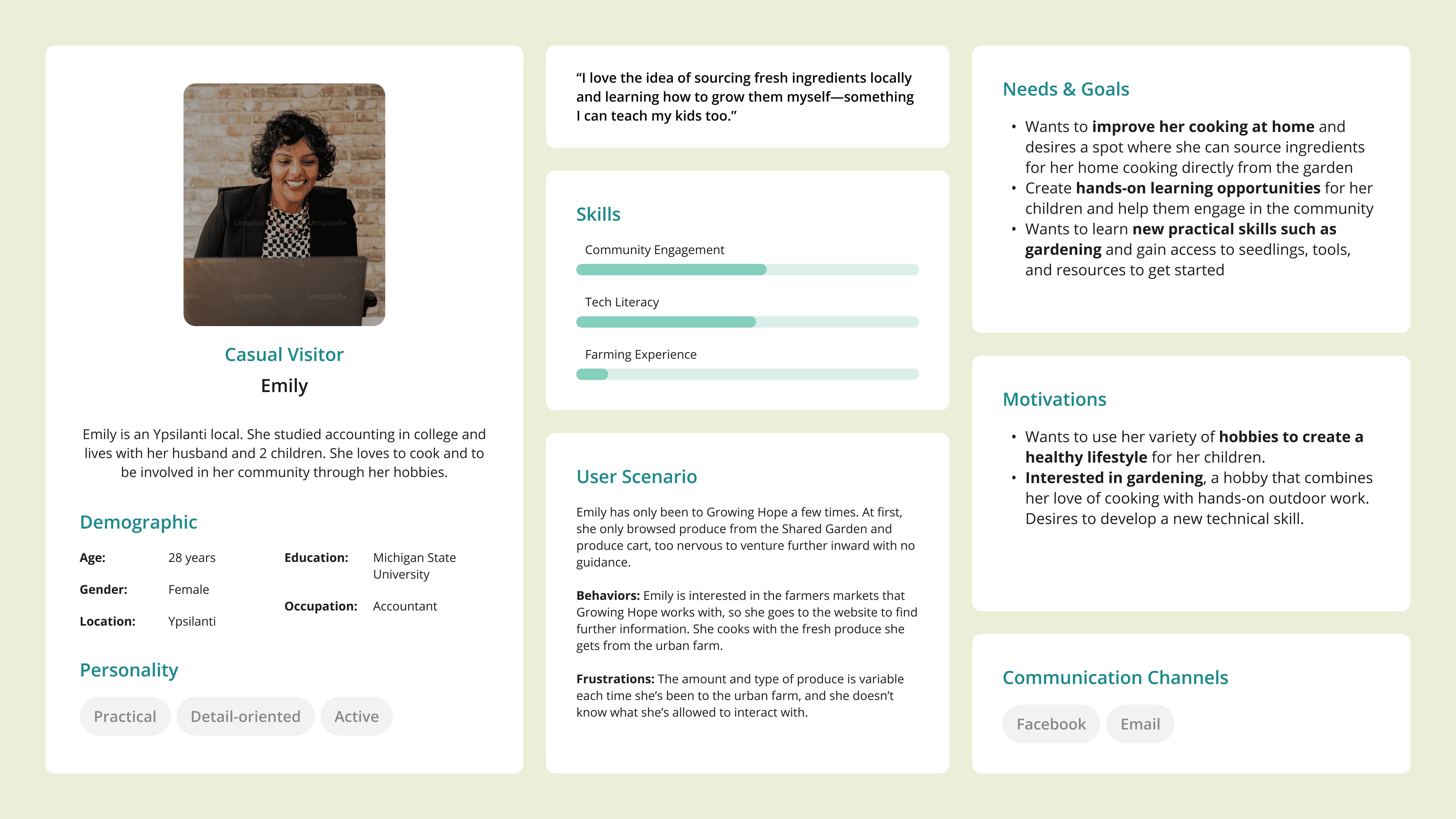
USER PERSONAS
Volunteers, educators, staff, and visitors
Based on the insights from our research, we created user personas to better understand the motivations, pain points, and behavior of our stakeholders.
Design Iterations
Our iterative design process involved unfiltered ideation, low-fidelity sketches, mid-fidelity wireframes, and multiple rounds of user testing and peer reviews to refine our interactive map prototype.
SKETCHES
Each person created two sketches in response to each prompt based on the design requirements we gathered from our research insights. We then conducted dot voting, narrowing it down to the most successful two or three images per prompt.

MID FIDELITY & ITERATIONS
The iterative design process
We gathered feedback from peer evaluations and concluded that a vertical orientation, outlined walkways, and color-coded sections were much clearer and provided more context to the organization of the farm. We experimented by using numbers, titles, and both.
After receiving feedback from our client and peers, we decided to use a mix of whitespace and lines to denote pathways on the farm to inform users of where they are encouraged to walk.
CONSTRAINTS
Platform chosen: Framer
After experimenting with various map-making platforms such as MapMe, Drawpoint, and Image Map Pro, we decided to design and implement the map using Framer, a no-code website builder. We utilized their Content Management System (CMS) so that the client is easily able to update the content. Being able to consolidate into one platform sharpened the direction of the project and allowed us to adapt our designs accordingly!
Usability Testing
We conducted 16 usability tests in our evaluation phase, with the objective to evaluate if users can understand labels, icons, and legends without confusion, understand key facts about areas, and efficiently plan their routes. We aimed to identify pain points in wayfinding and information retrieval across both map formats.
KEY FINDINGS & FIXES
Usability testing on the digital prototype highlighted discrepancies between our anticipated user interactions and their actual behaviors. This feedback informed the next iterations and final map design.
📍 44% of users seek more clarification on how to orient themselves
🗺️ 37% of users are confused about how to interact with the map
🌳 75% of users would like clearer denotation across farm spaces
🐮 87% of users want to know about common spaces or landmarks to visit
Design Solution
Visit Digital Map!
By modifying some of the interactions on the digital prototype and improving the layout of the physical map based on feedback from our usability tests, we created a more approachable, intuitive, and inclusive visitor experience for a wider audience.
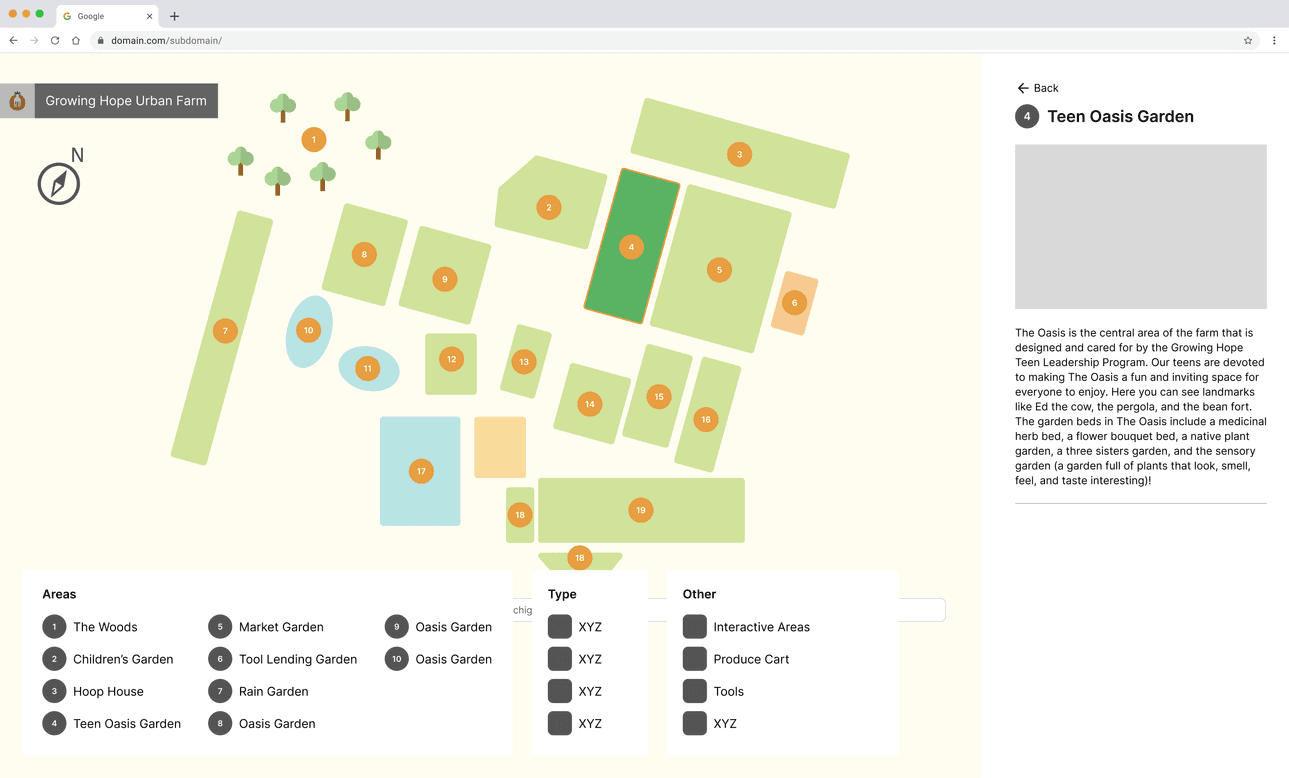
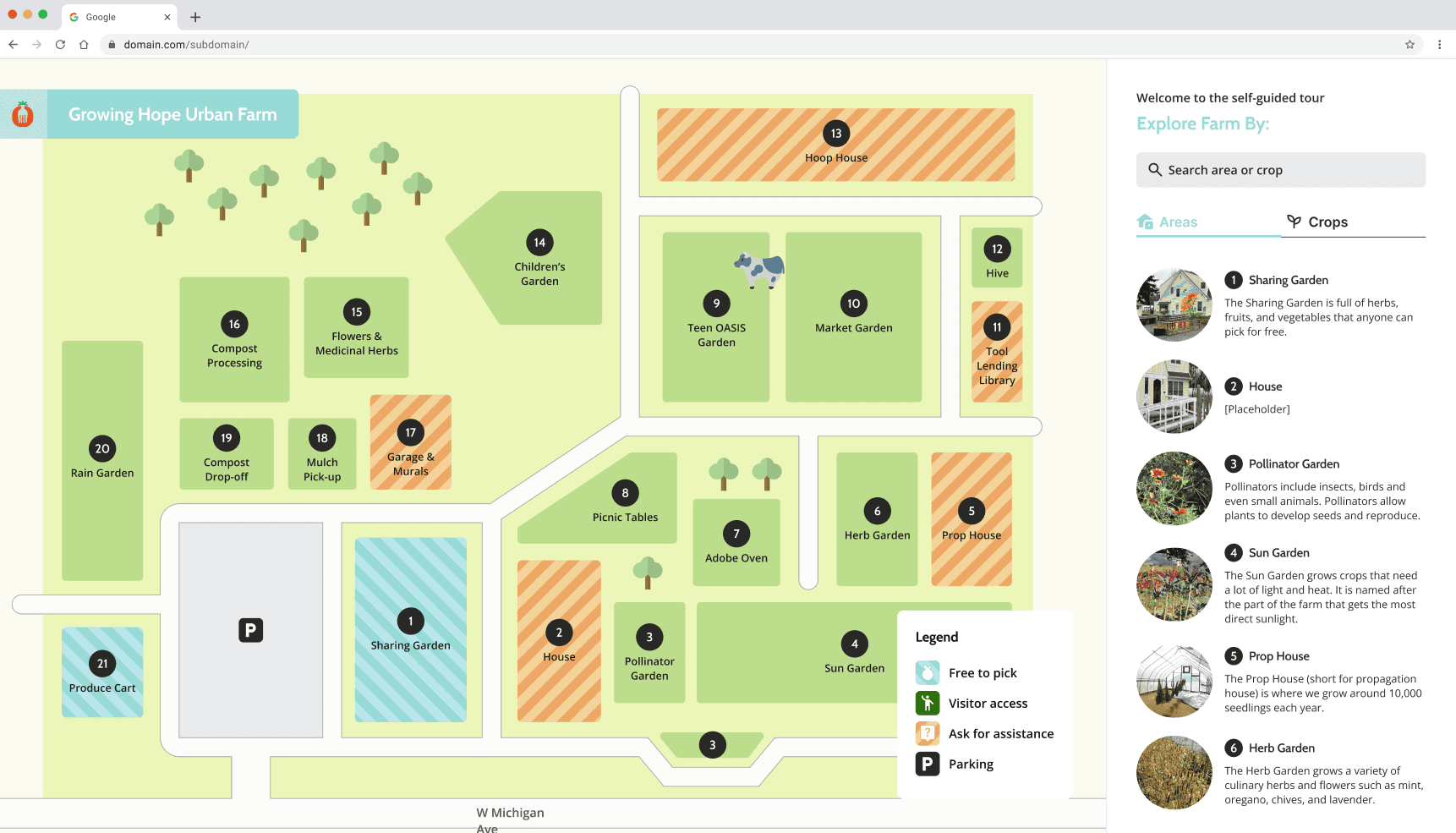
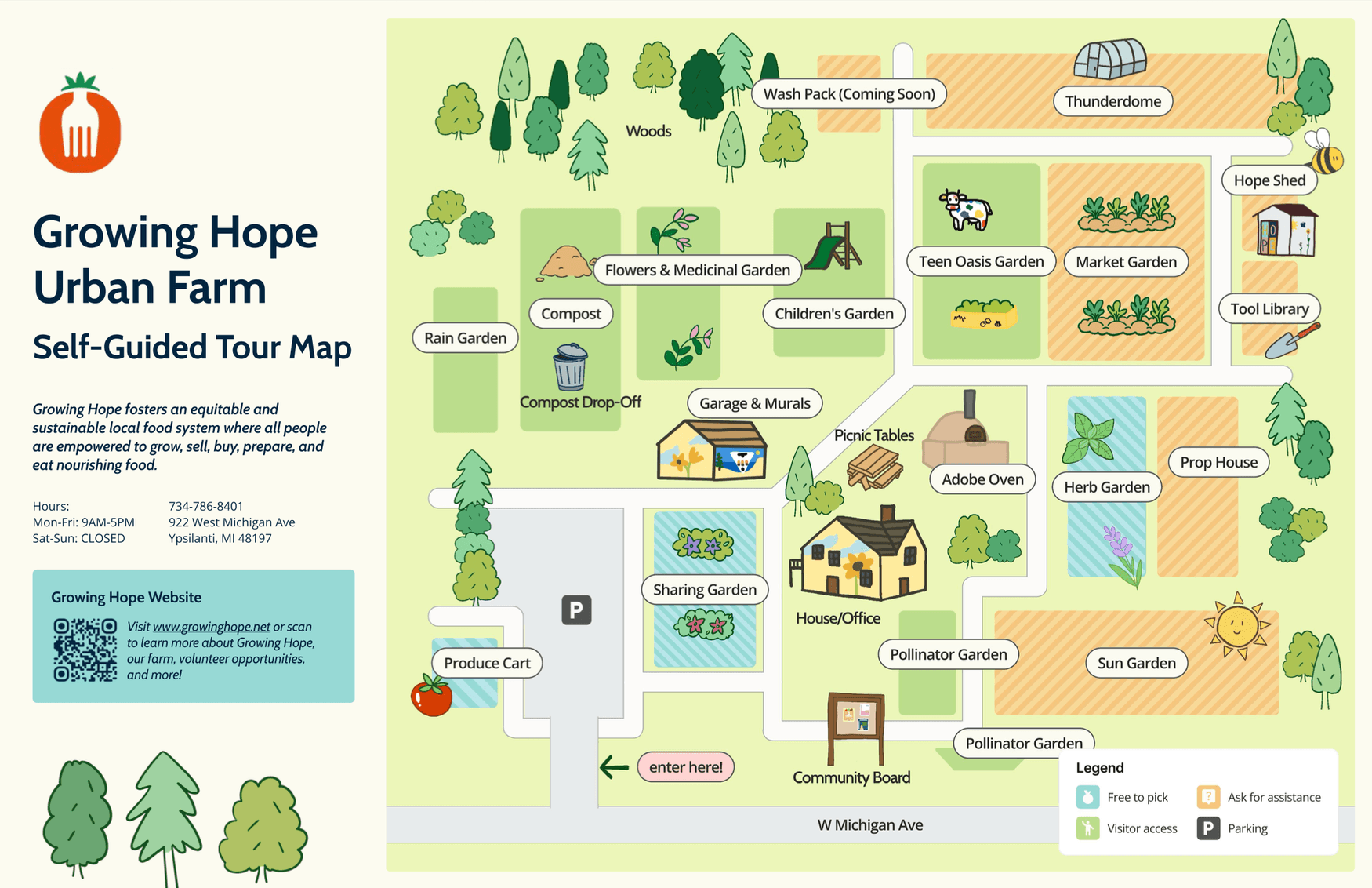
MAP HOMEPAGE
The main screen of the interactive map features an illustrated and colorful view of Growing Hope's farm.
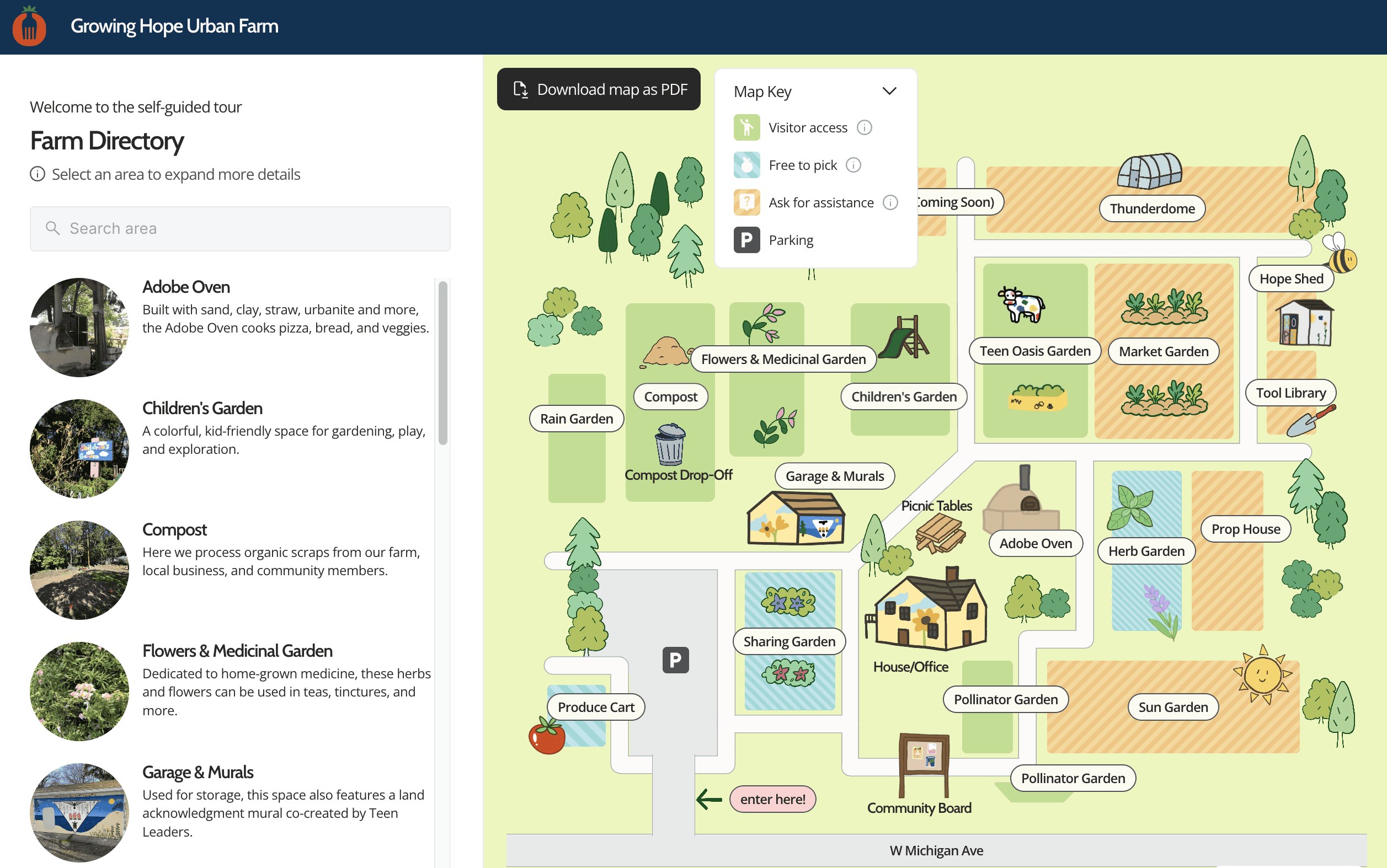
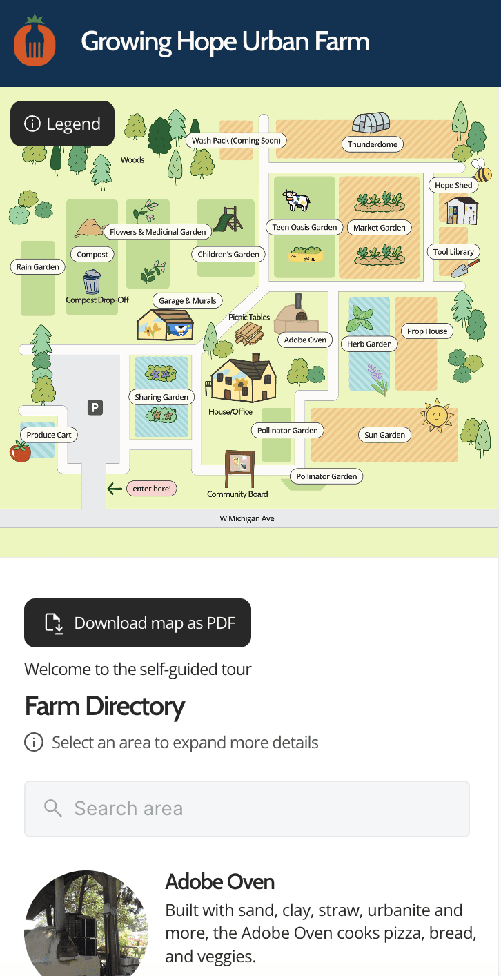
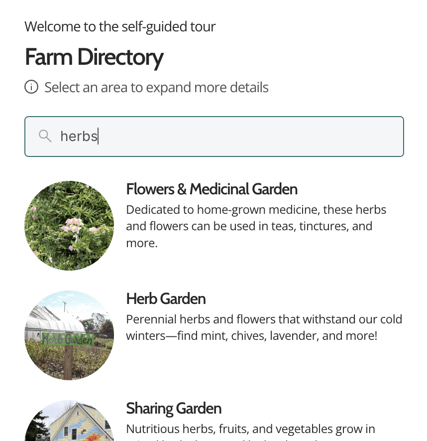
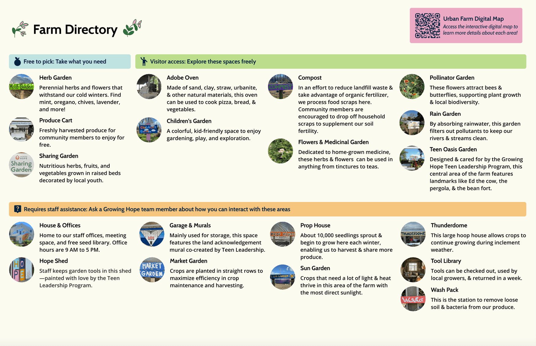
SEARCH & DIRECTORY
In the sidebar, users can search by keyword to easily find the corresponding farm section.
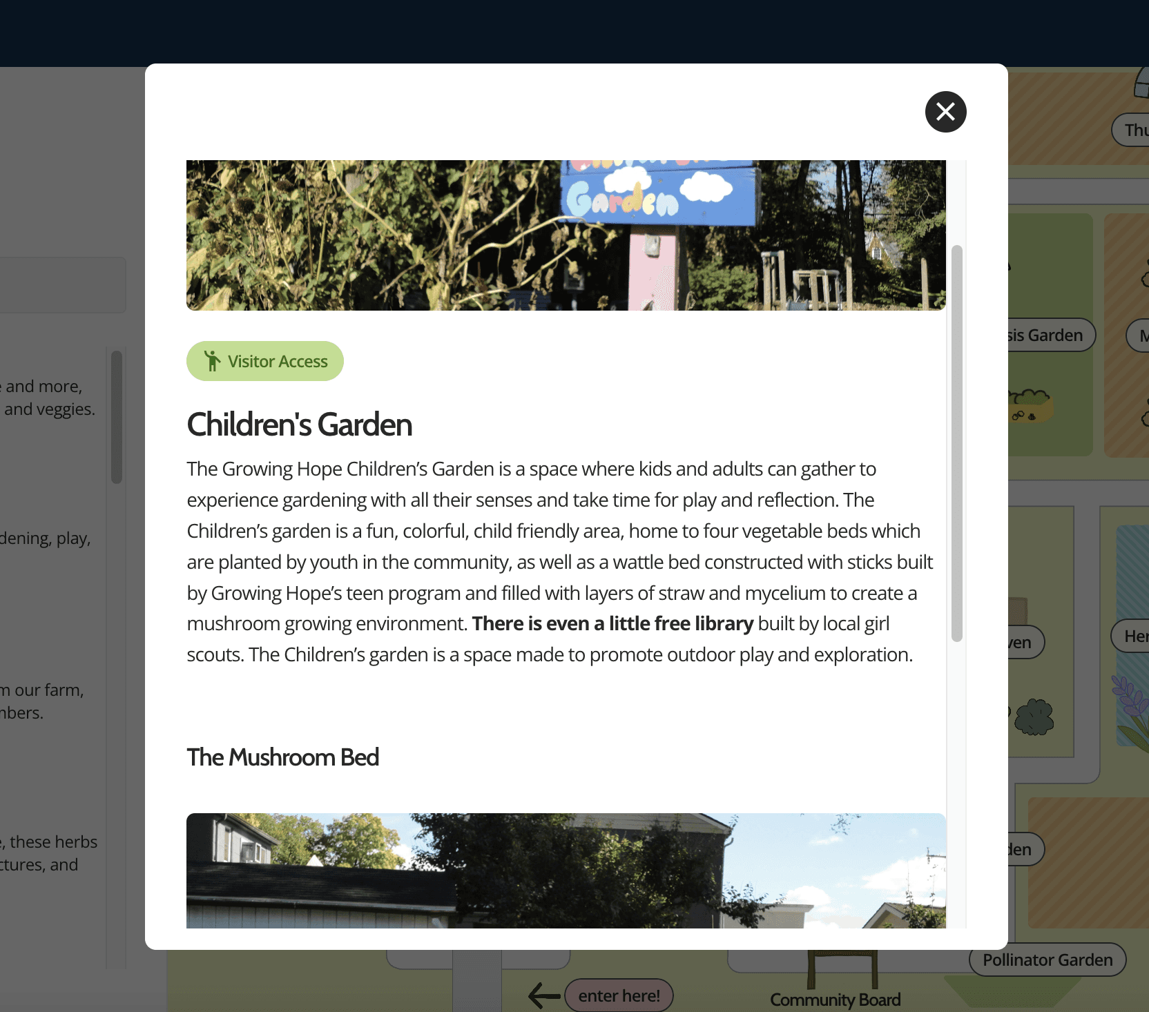
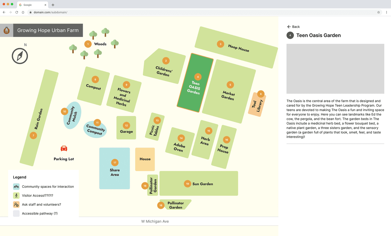
OVERLAY DESCRIPTION
Learn more about each area by clicking into the overlay from the directory! The access level is denoted, along with useful information about what grows in each area, activities that take place there, and other fun facts.
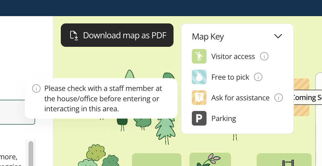
MAP KEY
Each section has a color-coded area of access, indicating which areas are open to all and which require assistance.
PHYSICAL MAP
The physical map is laminated and available for visitors who come to Growing Hope's farm, ensuring digital and physical accessibility to access information on-site.
Documentation
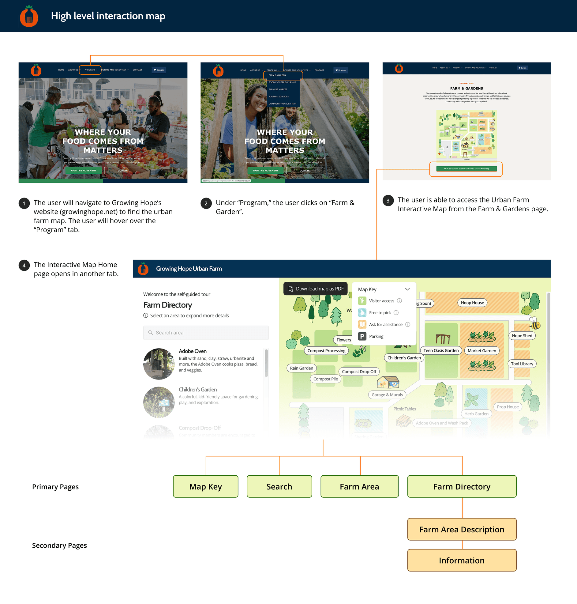
HIGH-LEVEL INTERACTION MAP
The Interactive map is nested in the Farm & Gardens page of Growing Hope’s website. This flow is indicated in the high-level interaction map, as well as the pages the user can visit within the map.
Reflections
🌱 It was amazing to work with the Growing Hope team for my UX Design capstone! I learned so much about taking a project from prompt to publish while considering client requirements and stakeholder needs. I enjoyed engaging with the Ann Arbor and Ypsilanti community while conducting research and evaluation, and furthering my technical knowledge of map-designing platforms during the design phase.
🍀 Designing on a new platform was initially challenging, but I learned how to lean into Framer's advantages to create designs suited for its capabilities. We published the digital map in website format & printed physical copies for lamination and reuse at the farm. I am excited to see how it continues to impact Growing Hope's community!

